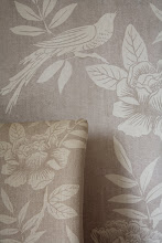
on my little jaunt to London last week for design week I stopped at the Designers Guild showroom and shop in Kings Rd. Designers Guild and Osborne and Little (my old employers!) don't show in Chelsea Harbour, they chose to retain their old showrooms on kings rd, and I am so glad they did, it is much nicer to go there than the homogeneous chelsea harbour showroom complex.
I love the space and the styling in Designers Guild. Tricia Guild is ever so clever, a bit like Nina Campbell and Cath Kidston (now I know the three of them have nothing in common in terms of aesthetic, but i shall explain!) - all three of them have stuck to their design principles, they have a style, they know their style, and they are good at their style. They don't stray, they just do it and build on it. They have a recognizable but (perhaps with the exception of Cath Kidston) indefinable 'look'.
Tricia Guild and her team do colour brilliantly. She has an innate sense of colour and what works. she is not afraid of colour, and is not afraid of what many of us would consider challenging combinations.
the space and light in the designers guild showroom is so lovely, it enables customers to feel that the DG world is accessible to them and they can be part of that look.
there was alot of this colour around and about at design week, that yellowy green that doesn't seem to have a definable name - i call it mimosa in my range! here Designers Guild have teamed it with various shades teal and grey, and it works really well.
Incidentally there was a lot of grey popping up in various showrooms at deign week, i do believe it works better in interiors than in fashion - i still can't get a grip of wearing school uniform colours - so dull.
it was nice to see a few old friends hiding in the DG showroom too, julie arkell above tucked next to some glamorous wallpaper, and apolline below on the end of a childs bed. - very nice for me to see an apolline creation in the flesh.
sorry I know i have posted loads of pictures again but its nice to see lots of visuals.


I adore julie arkells work, and the combination of mimosa( i would call it that too - its not mustardy enough to be mustard!) and teal with grey to calm it down, so fresh and modern, but retro too. yum yum.
ReplyDeleteWhat gorgeous pics Sarah! I love the striped couch with the 'Mimosa' and teal. Lovely also to see Julie Arkell's gorgeous work tucked in there too! Thanks for sharing these gorgeous colourful pics, they have certainly brightened up my dull Autumn day! ~ Tina xx
ReplyDeleteI would love to wander through this adorable place.The colors, the textures...everything looks adorable from your photographs.Take care!
ReplyDeleteThanks for sharing these photos Sarah - truly inspiring!
ReplyDeleteGreat blog. Look forward to following to see more of this luscious stuff! xo Erica
ReplyDeletehttp://moth-design.blogspot.com/